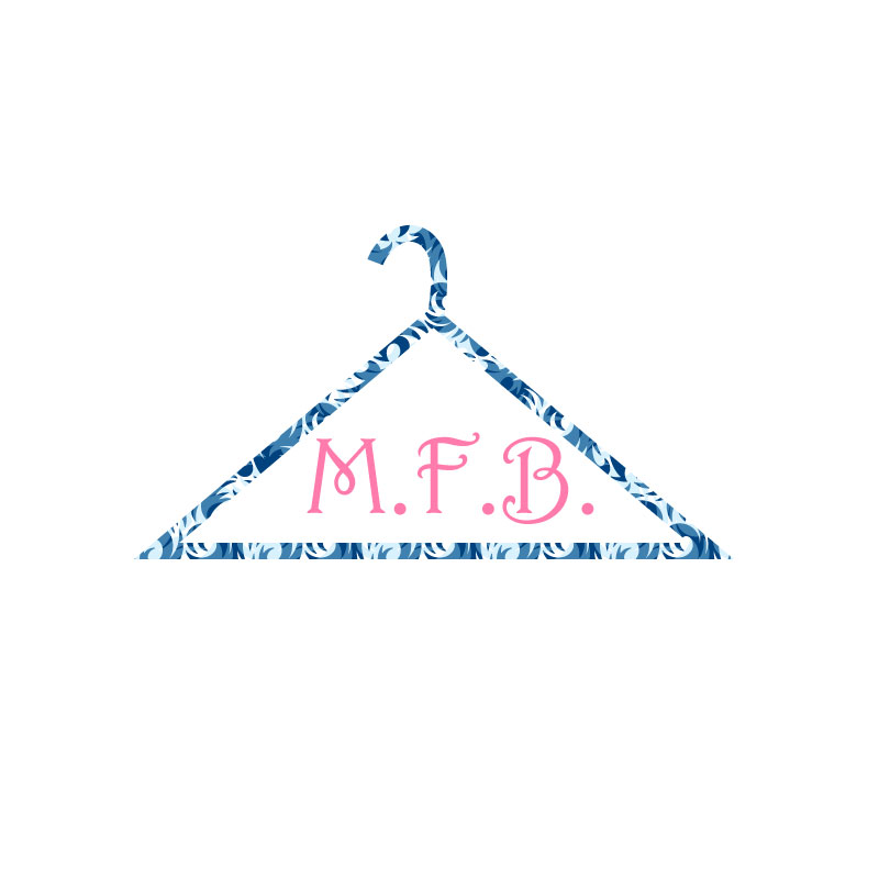
My design process overall from start to finish was a lot of fun creatively. A thing that I chose to change was the stroke, I thought it was important to make it a little thicker. Overall, I think it looks really nice, and I love the print of the hanger and the colors I picked out. I wanted my logo to be clear simple and to the point and that’s what I feel I have achieved here. Also, below M.F.B. I wanted to put Madeline’s Fashion Blog to really get the point across, but I took it off because small letters would take away from the overall look.
Idea and Inspiration
I decided to create a logo that represented my blog in a simple yet cute way. I chose a hanger because it really represents the fashion world, most clothing items are sold on hangers, so I thought it was the perfect logo. In the middle I put M.F.B. which stands for Madeline’s Fashion Blog. I thought it was a good and short way to add it in without it being super wordy.
Design Process
The designs that influenced me the most would be, simple designs that get to the point and show you what a business or blog stands for, without having to spell it out for you. The research that I did was, mostly thinking about things that are commonly used in the shopping world, and one of my ideas was a hanger. I wanted to keep my logo simple and to the point, so I thought by having a hanger it would put a lot of significance on it, so it would be the focal point. My design process was first brainstorming ideas, then drawing out things that I liked, then I played around a lot in Adobe Illustrator.
Technical Detail
I chose to mostly draw out my logo with the pen tool and the curvature tool, adding a large stroke text and fill colors while adjusting the text character. My process for constructing my project was taking things I learned from photoshop and applying them here because most of the tools and concepts are the same. Also, the tutorials helped with things that I was struggling with or just didn’t know how to do. A lot of the issues I had were mostly with the curvature tool and getting the hook on my hanger look proportionate and like it matches with the rest on the hanger itself. The solutions that I found was mostly just taking my time and not rushing and just making sure that everything lined up perfectly.
